The end of the plain plane
How a visionary woman, a fashion designer, and an architect transformed an airline and revolutionized an industry
Have you noticed that airlines are starting to look—and act—the same?
When Southwest ends its longstanding open seating policy next year, it will mark the end of one of the last remaining distinctions that sets it apart from its competitors—the latest in a slew of changes that have slowly led to the homogenization of the airline industry. A few others: Delta recently updated their boarding process to numbered zones, just like United and American, while American now offers passengers the Biscoff cookies that were once unique to the Delta experience.
It’s been well-documented that many industries have seen a shift towards more streamlined, minimal design, losing what makes them memorable in the process. We’ve watched as all kinds of companies, from fashion houses to carmakers, have rebranded themselves to bland brands devoid of personality. Vibrant architectural styles like the pastel hues and intricate ornamentation of Art Deco have given way to minimalist aesthetics dominated by glass, steel, and concrete. But there’s another casualty of this trend you may have missed: airline liveries—once bold and creative, their vibrant paint schemes have gradually been replaced by safe, subdued designs.
But it wasn’t always this way. There’s a fascinating story behind how airlines once embraced bold colors and creativity—and how one visionary campaign changed the skies forever. To understand the transformation, it’s important to look back at a time when practicality and uniformity dictated design.
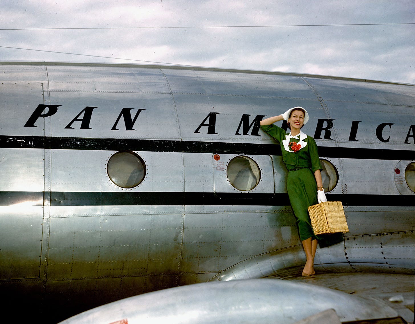
Pre-1965, Airline execs saw liveries as a tool to communicate trustworthiness and professionalism, so they were primarily focused on practicality. Bare metal finishes were preferred to reduce weight and design schemes were usually limited to conservative colors and styles. In short, liveries were not considered as a part of a broader marketing strategy, and aesthetics weren’t really given much thought.
But one innovative airline, along with one visionary woman, was about to change that.
Braniff International Airways, founded in the 1930s, had grown into a profitable global airline by 1965 but still lacked household name recognition. Its new president, Harding Lawrence, sought to change this through a bold new corporate identity that would position the airline as an industry leader. He brought in Mary Wells, a Madison Avenue ad exec, and asked her and her agency to come up with a big idea to make it happen.
She got to work analyzing the experience of flying with Braniff and found a number of ways it could be improved: cheap materials, bland uniforms, and unexciting liveries were among them. In her memoir, A Big Life, she recalls her solution: “I saw Braniff in a wash of beautiful colors.”
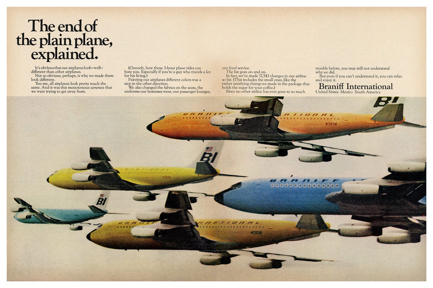
The end result was a campaign called, “The End of the Plain Plane,” which unveiled a 360° overhaul of the airline from its name1 to the sachets of sugar served in-flight.
Wells’ vision transformed Braniff into the first airline to fully embrace the potential of liveries as a branding and marketing tool, revolutionizing the industry in the process.
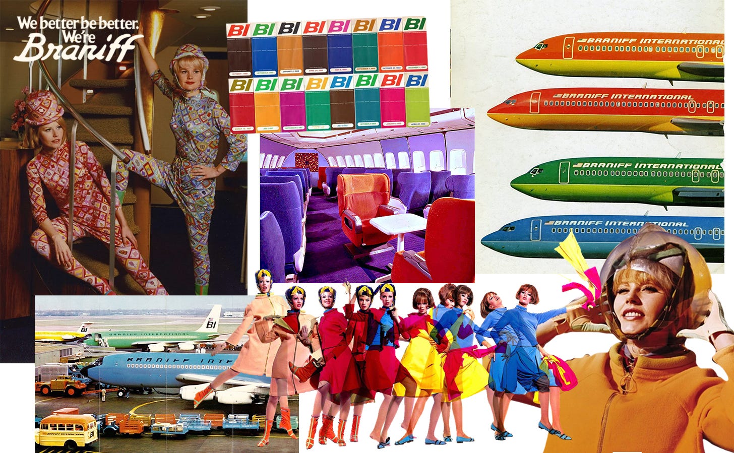
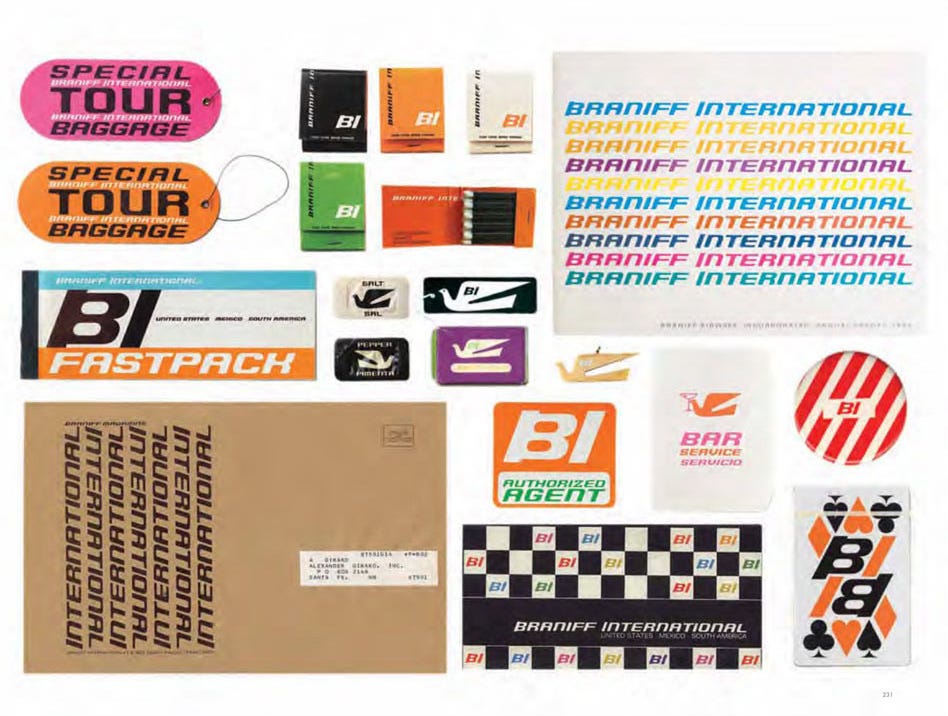
To make it happen, Wells did a curious thing: she hired non-industry designers to help with the rebrand. One was architect and designer Alexander Girard, who was known for his use of vivid color and playful patterns.
The first step was revamping the livery. Initially, they visualized the entire fleet painted in the same, solid color. But Wells had a groundbreaking design idea: why not paint the fleet in a variety of solid colors?
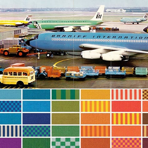
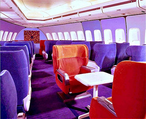
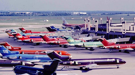
In total, Braniff introduced seven exterior paint colors, each in a striking hue hand-picked by Girard. To add contrast, each plane also featured white wings and a white tail. Having multiple colors and unique designs in their fleet fostered a sense of individuality and fun; it almost added a gamified element to flying—which color will you get this time?
“The idea was to make a plane like a great racing car—with the fuselage painted a solid color clearly expressing its shape.” — Alexander Girard
Girard sought to replace the monotony of typical airline identities with something more inspired and lively; ultimately, he designed more than 17,000 elements ranging from the visual identity and lounge furniture to matchbooks and menus.
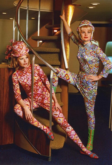
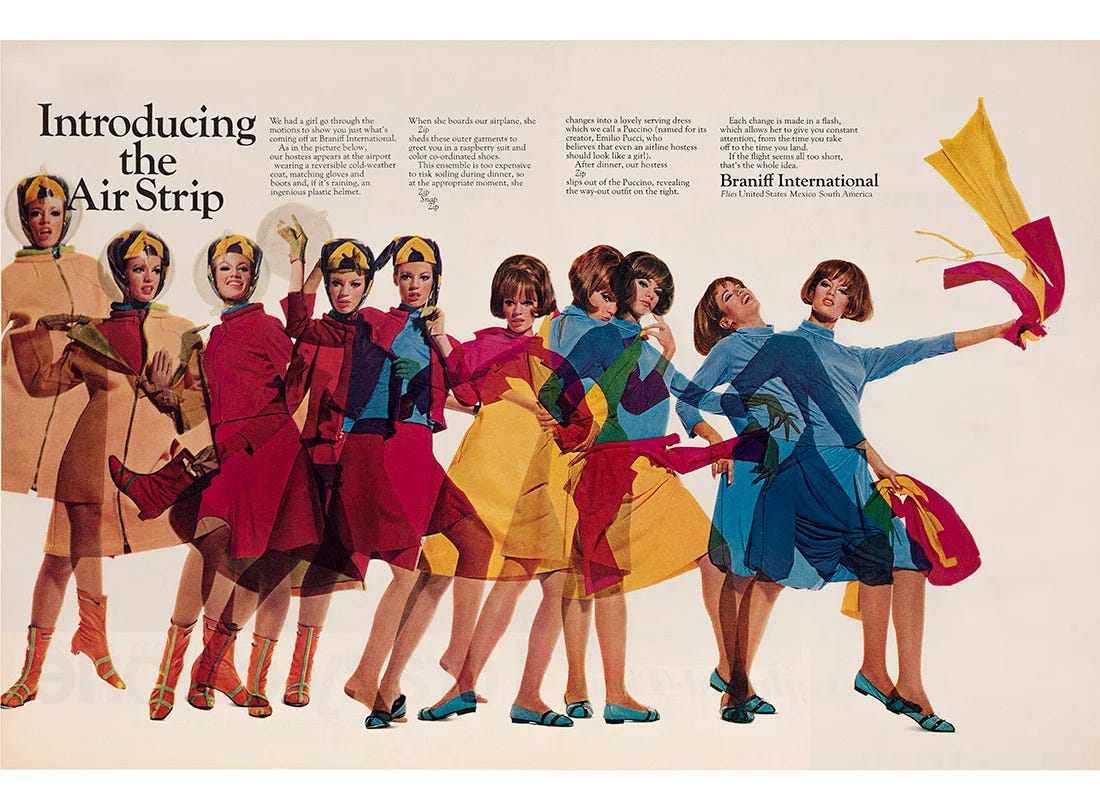
Wells made another legendary decision in bringing in fashion designer Emilio Pucci, who created space-age uniforms that reflected contemporary fashion trends. He was the perfect partner to carry Girard’s new visual identity into the fashion of the flight crew; Pucci’s kaleidoscopic prints and vibrant colors further emphasized the vitality of Braniff’s new look.
Pucci's designs introduced glamour and high fashion to aviation—a major departure from the utilitarian styles that had long dominated flight crew uniforms. Between 1965 and 1974, he created six distinctive collections for Braniff, establishing a trend of designer collaborations that continues to influence the industry today2.
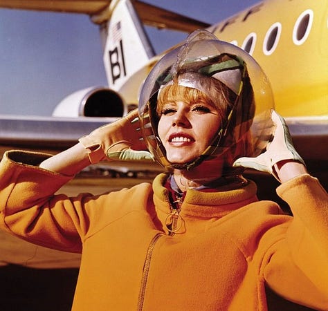
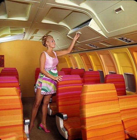
Introduced alongside the uniforms was a campaign called the “air strip”—an in-flight experience where flight attendants would remove a piece of the multi-layered uniform as the flight progressed—which was conceived to attract business fliers (who, at the time, were mostly men). In the television commercial, a flight attendant seductively removes layers of her uniform until a voice says, "The Air Strip is brought to you by Braniff International, who believe that even an airline hostess should look like a girl.” Note that the term “hostess” is used rather than flight attendant or stewardess—another deliberate decision to appeal to men.
Interestingly, it was Wells who came up with the idea. Her quote—“When a tired businessman gets on an airplane, we think he ought to be allowed to look at a pretty girl”—highlights the complexities of the era. Wells was operating in a male-dominated industry, and her decision to play into gender norms and sexualized marketing was likely a strategic move to succeed within that framework. This campaign marked a pivotal moment in aviation history, spurning the trend of flight attendants being sexualized in advertising and media. It raises important questions about the compromises women in leadership had to make to succeed in industries where sexism was both widespread and financially advantageous.
The campaign successfully positioned Braniff as a chic and stylish option that brought fun to flying. Profits soared; Braniff’s shares rose from $24 in early 1965 to almost $200 a year later. Post-rebrand, the arrival of the Jet Age brought increased competition along with it, pushing Braniff to take even bolder steps to stand out in the crowded industry.
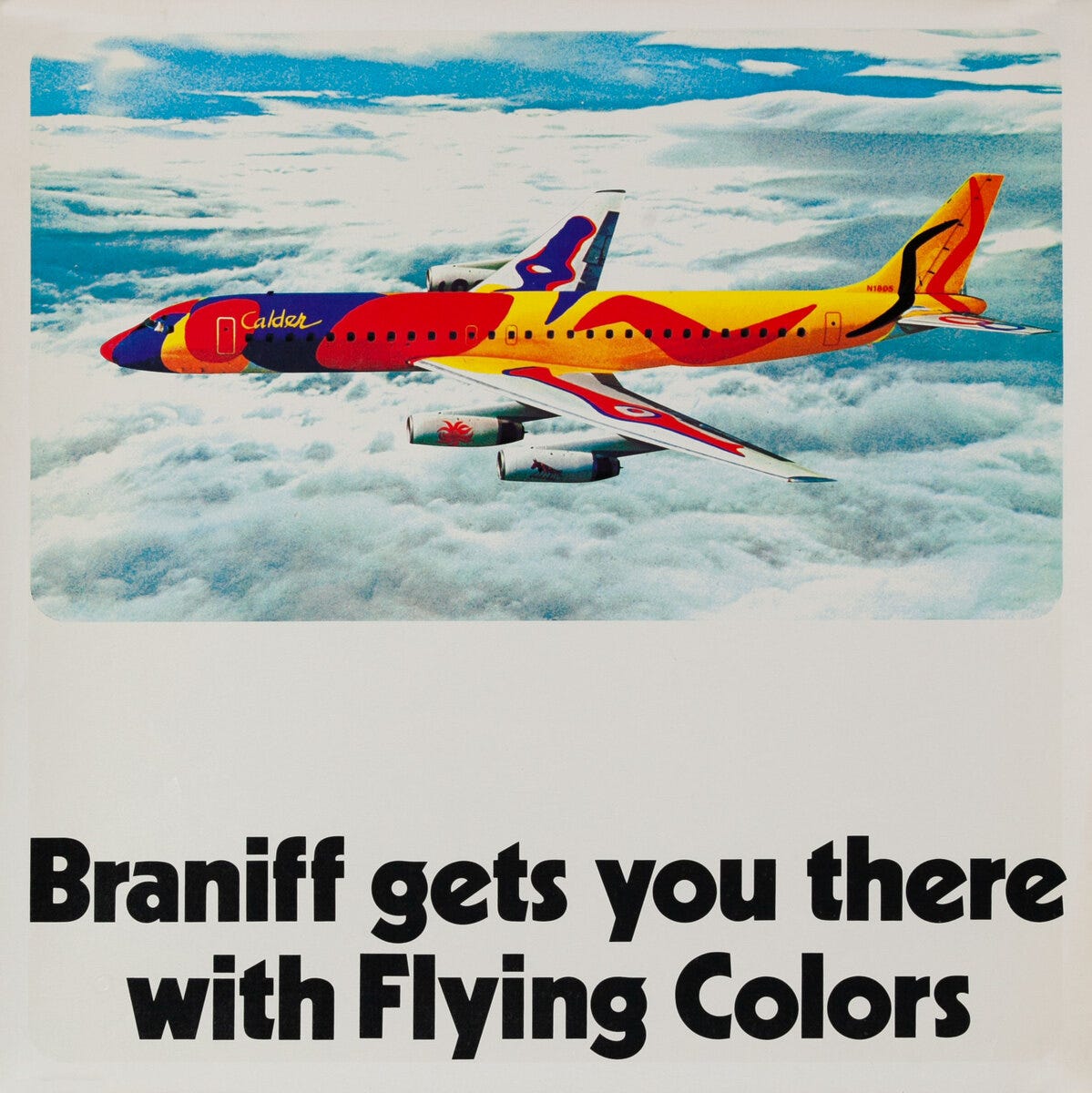
This led to one of Braniff’s most imaginative moves: a collaboration with Alexander Calder, one of the 20th century's most celebrated artists. Calder was commissioned to design two aircraft liveries, transforming Braniff’s airplanes into "flying works of art.”
This unprecedented collaboration marked a first in aviation, introducing a major artist to the industry on a global scale. Calder’s iconic designs captivated affluent, culturally-savvy travelers and remain celebrated by aviation enthusiasts and art connoisseurs alike.
Mary Wells went on to shatter glass ceilings—becoming the first female CEO of a company listed on the New York Stock Exchange—and married Harding Lawrence, Braniff’s innovative president. Talk about a successful partnership!
Despite its bold innovations, Braniff International ceased operations in 1982 due to challenges created by deregulation3. However, its daring approach to branding left an indelible mark on the aviation industry, proving that creativity and risk-taking could transform even the most utilitarian sectors.
As we know, history has a funny way of repeating itself. Airlines today have largely abandoned the idea of bringing 'fun' to flying, instead reverting to the safe, standardized designs reminiscent of the pre-1965 era. While special edition planes4 still offer a flash of creativity, they’re often one-offs rather than a fleet-wide design ethos. There are some practical reasons for this5, but one major influence includes changing consumer priorities—today’s passengers value low fares and convenience over bold branding or imaginative design.
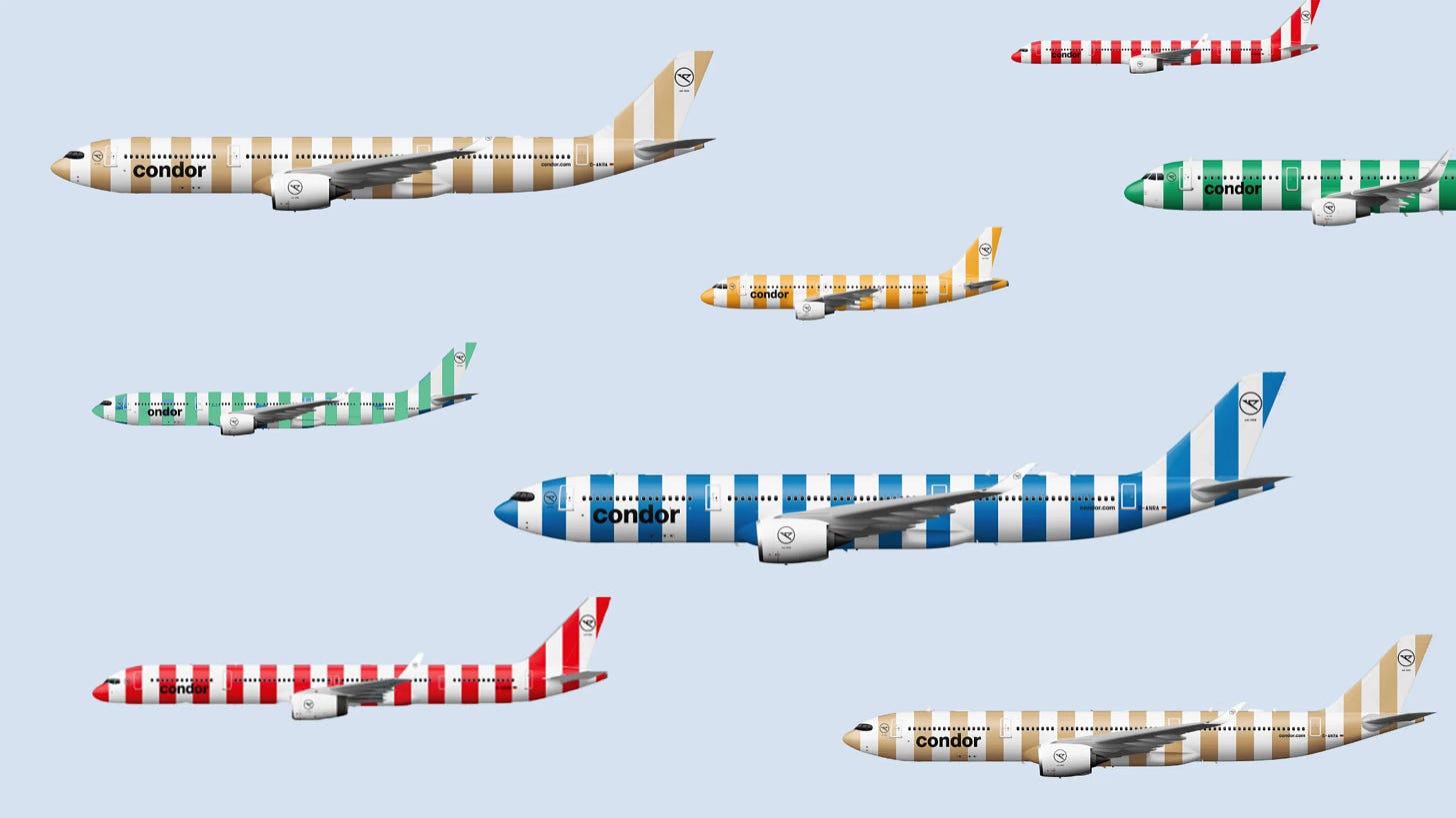
One standout in the current landscape that is prioritizing both is German leisure airline Condor, which seems to have taken a page from Braniff’s playbook. With its bold, candy-striped designs spanning the entire fleet, Condor embraces the spirit of audacious, memorable branding—proving that the legacy of Braniff’s daring creativity still has wings.
I hope you enjoyed this more in-depth exploration of aviation history—one of my favorite topics. If you'd like to read more pieces like this, please leave a comment and let me know! x Tori
Braniff International Airways became simply “Braniff International.”
Airlines still collaborate with fashion designers to create uniforms for their flight crew to this day. Some notable examples are Virgin Atlantic x Vivienne Westwood, Delta x Zac Posen, and, more recently, Air New Zealand x Emilia Wickstead.
The 1978 Airline Deregulation Act ended Civil Aeronautics Board oversight, resulting in lower fares and greater accessibility but also causing market instability, bankruptcies, and airline consolidation.
Obviously my favorites are ANA’s Pokémon planes. I also loved United’s 2019 “Her Art Here” campaign, a design competition that gave female artists the chance to use an airplane as their canvas. The winner had their design turned into an actual livery on one of United’s 757s.
White, the most common base color in liveries today, is favored for its practicality: it reflects heat, which improves fuel efficiency and lowers operating costs. Conversely, vibrant liveries are significantly more expensive to paint and maintain.




Bring back the air strip!!!!!!!
Great Article-as a kid I was lucky enough to fly internationally on several now deceased carriers. My favorite was Pan Am. Visits to the flight deck, peak into the cock pit talk to the pilots as a kid that was so cool. TWA was another, but Pan Am was it. The only other carrier I flew that came close was Dutch KLM. Back then customer service was an art. Good stuff.